Manal Secret Beauty Salon
Manal Secret is a Riyadh-based feminine beauty salon brand designed to feel refined, modern, and classy. The branding focuses on creating elegance without excess, where every detail feels intentional and every touchpoint is elevated yet approachable.
The visual identity blends soft feminine tones, clean structured layouts, and graceful contemporary typography to create a polished look and feel. From the logo to the social presence and service experience, Manal Secret communicates beauty through simplicity, consistency, and a strong sense of character.
Made to Be Seen, Felt, Remembered
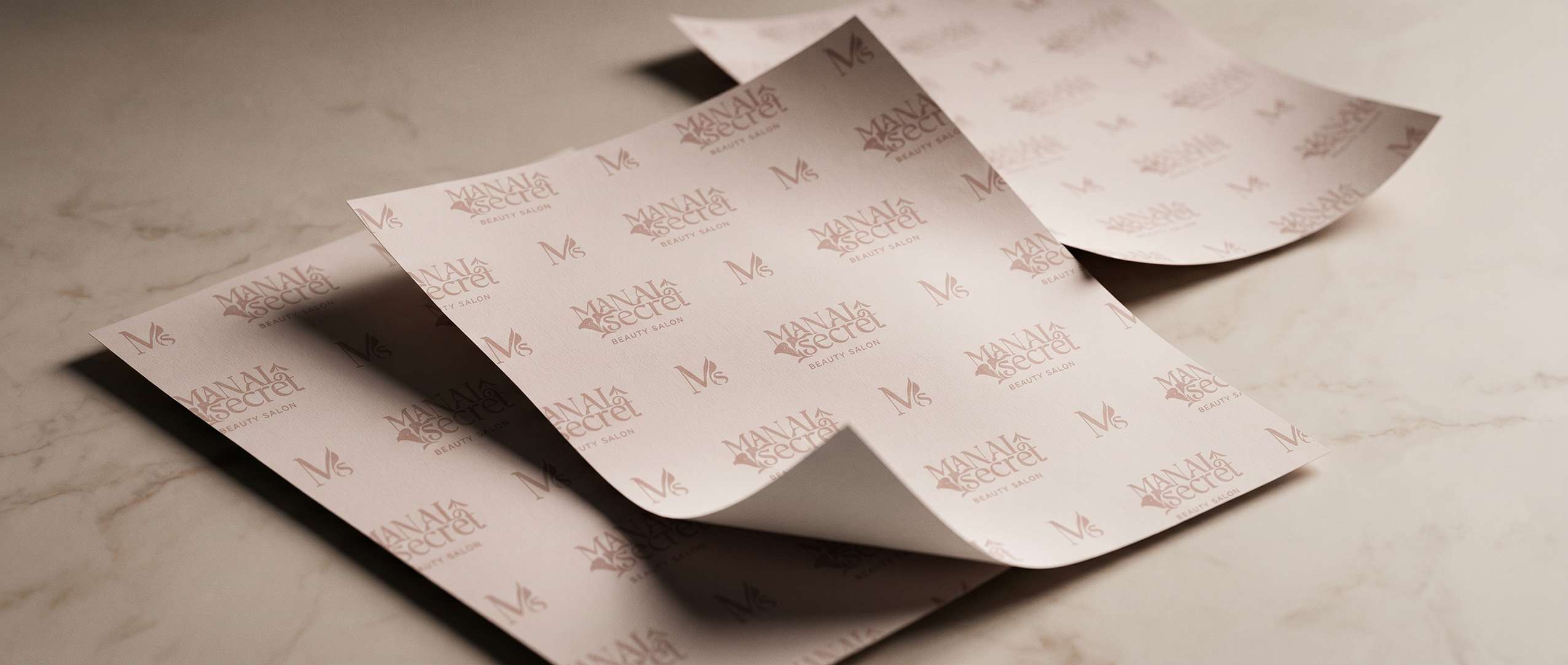
The Manal Secret logo combines elegant typography with a delicate calla lily motif, creating a refined and feminine visual signature. This floral element extends into the brand's icon, graphical elements, and pattern system, adding softness and consistency across applications.
A non-ornamented logo version was also created for professional paperwork and social media stories, ensuring the identity remains clear, practical, and adaptable across different uses.
Beauty, Built Into the Space
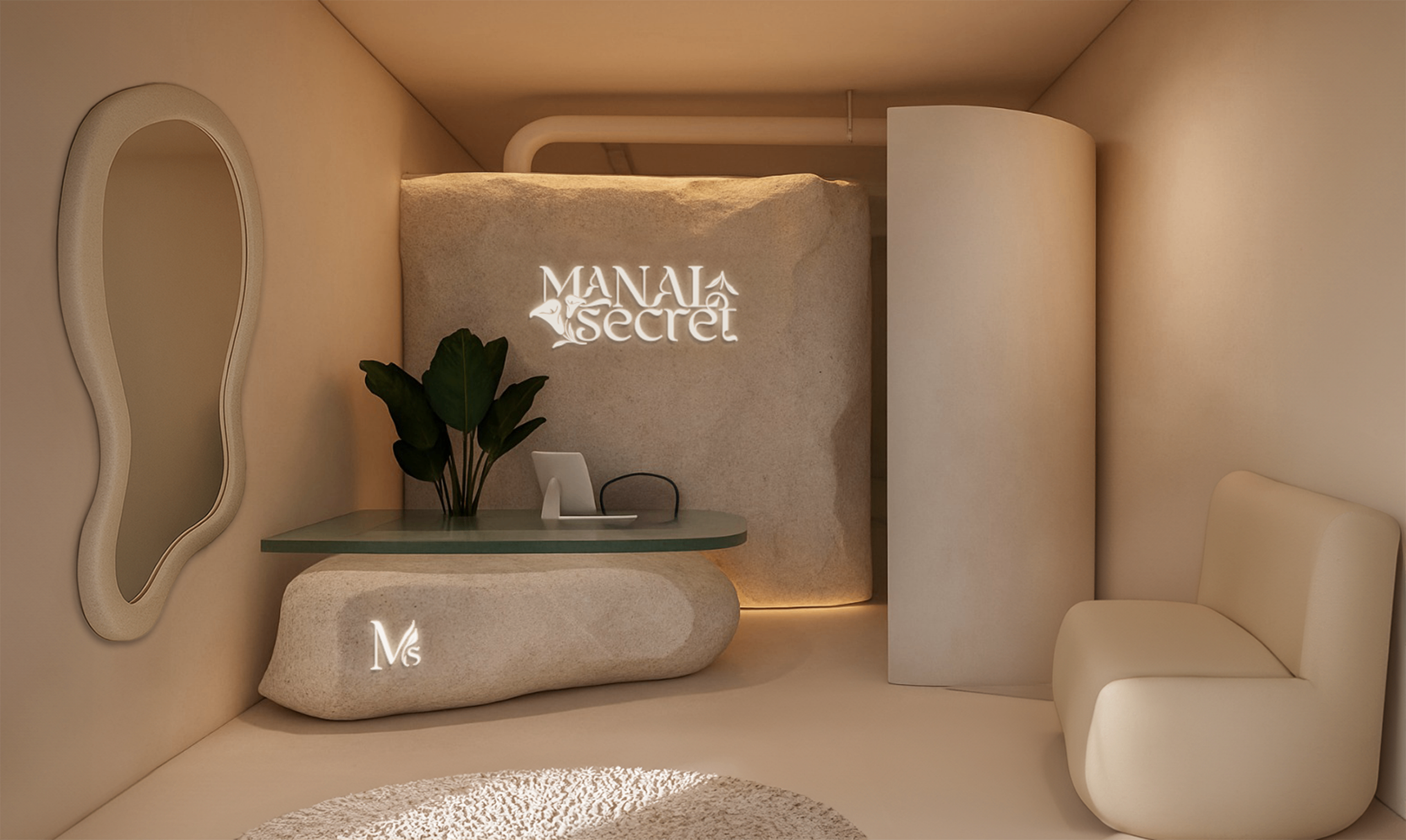
We collaborated closely with the interior designer to translate the brand into a physical space, ensuring every element reflects Manal Secret's identity. From materials and textures to lighting and spatial flow, the interior was crafted to embody the same refined, minimal, and elegant aesthetic, creating a seamless connection between the brand's visual language and the in-salon experience.
Signature Details Seamlessly Applied
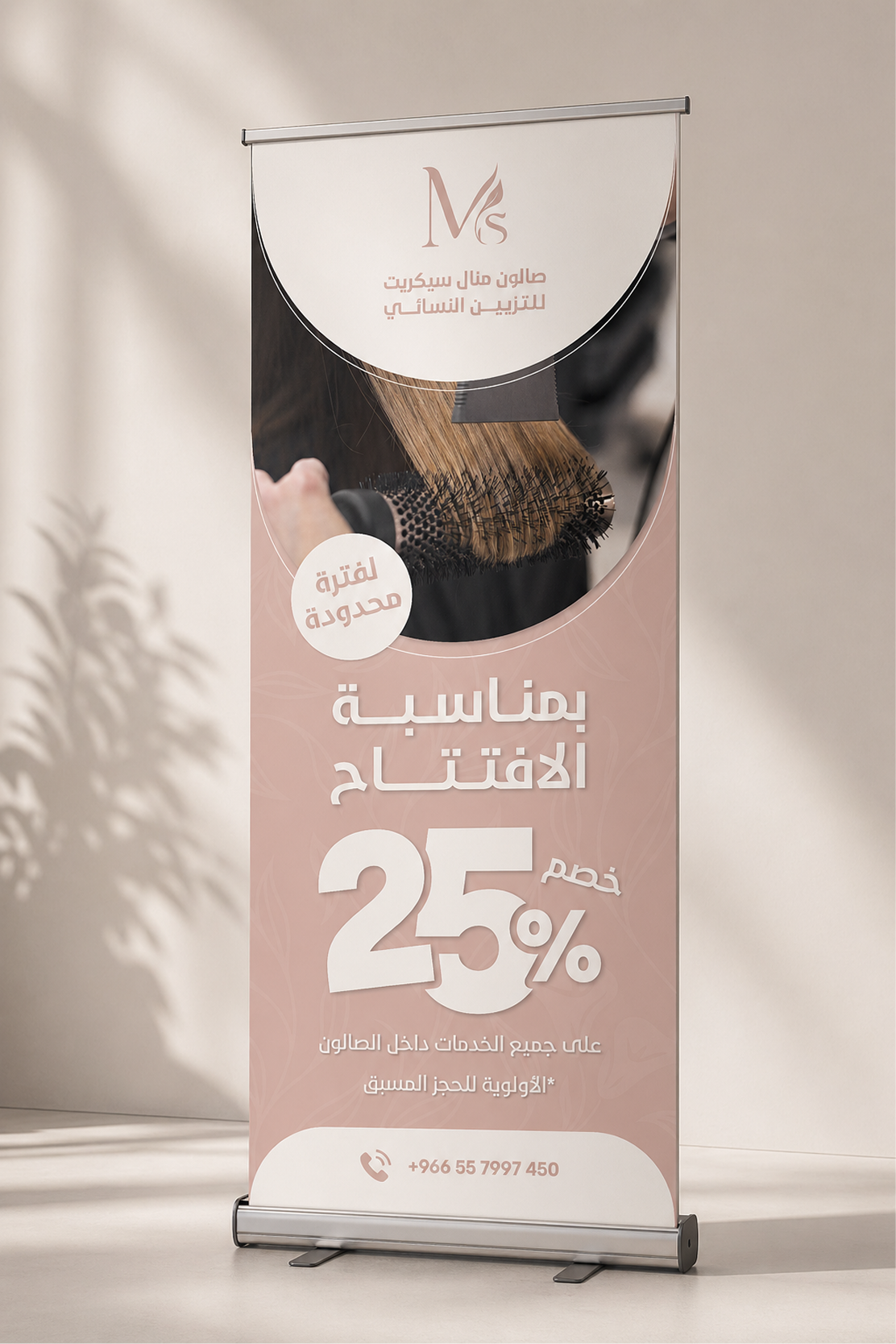
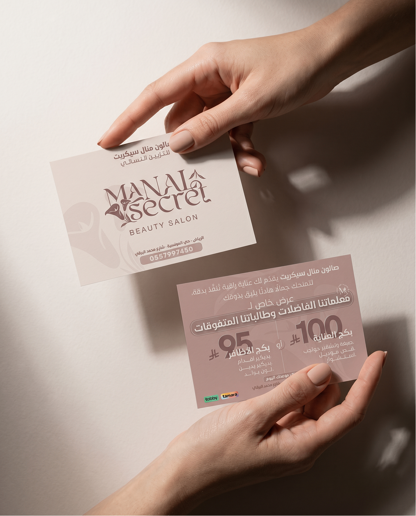
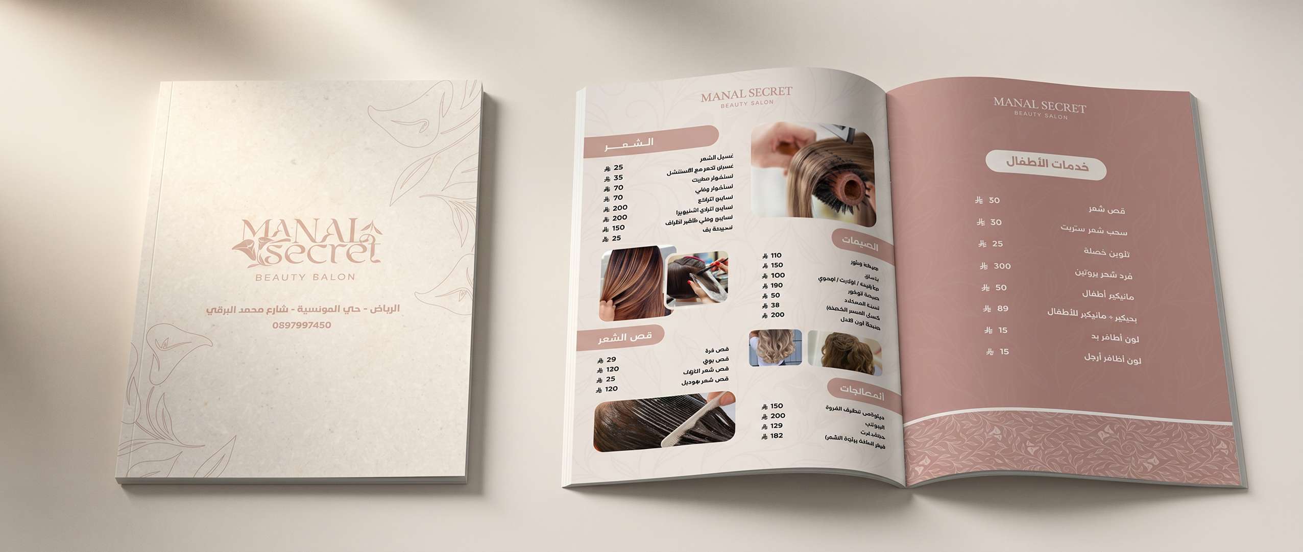
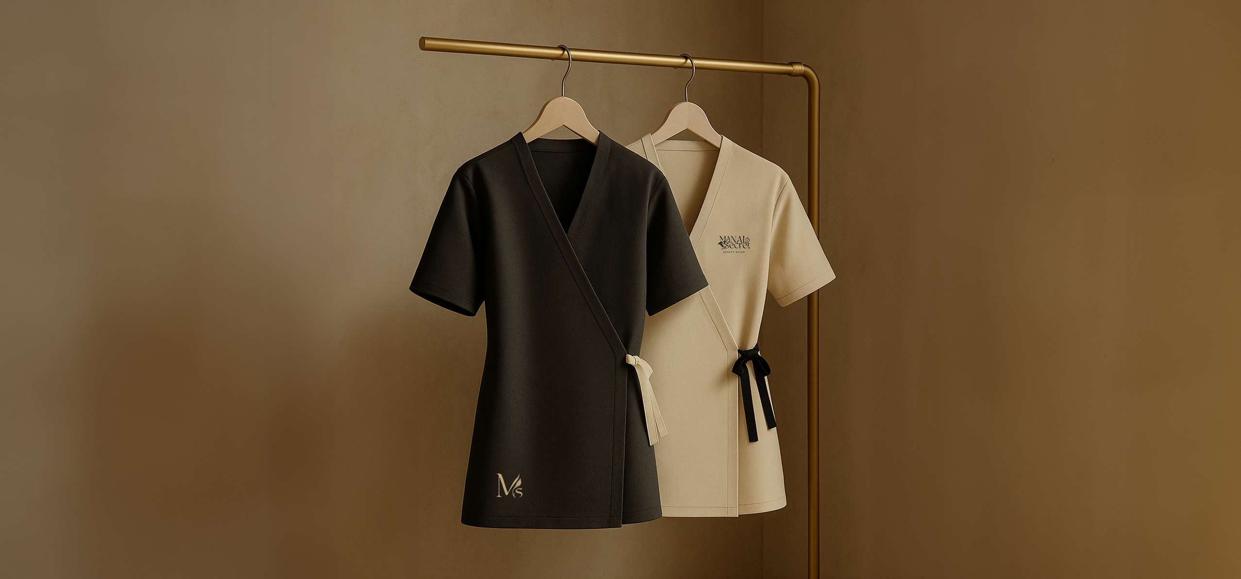
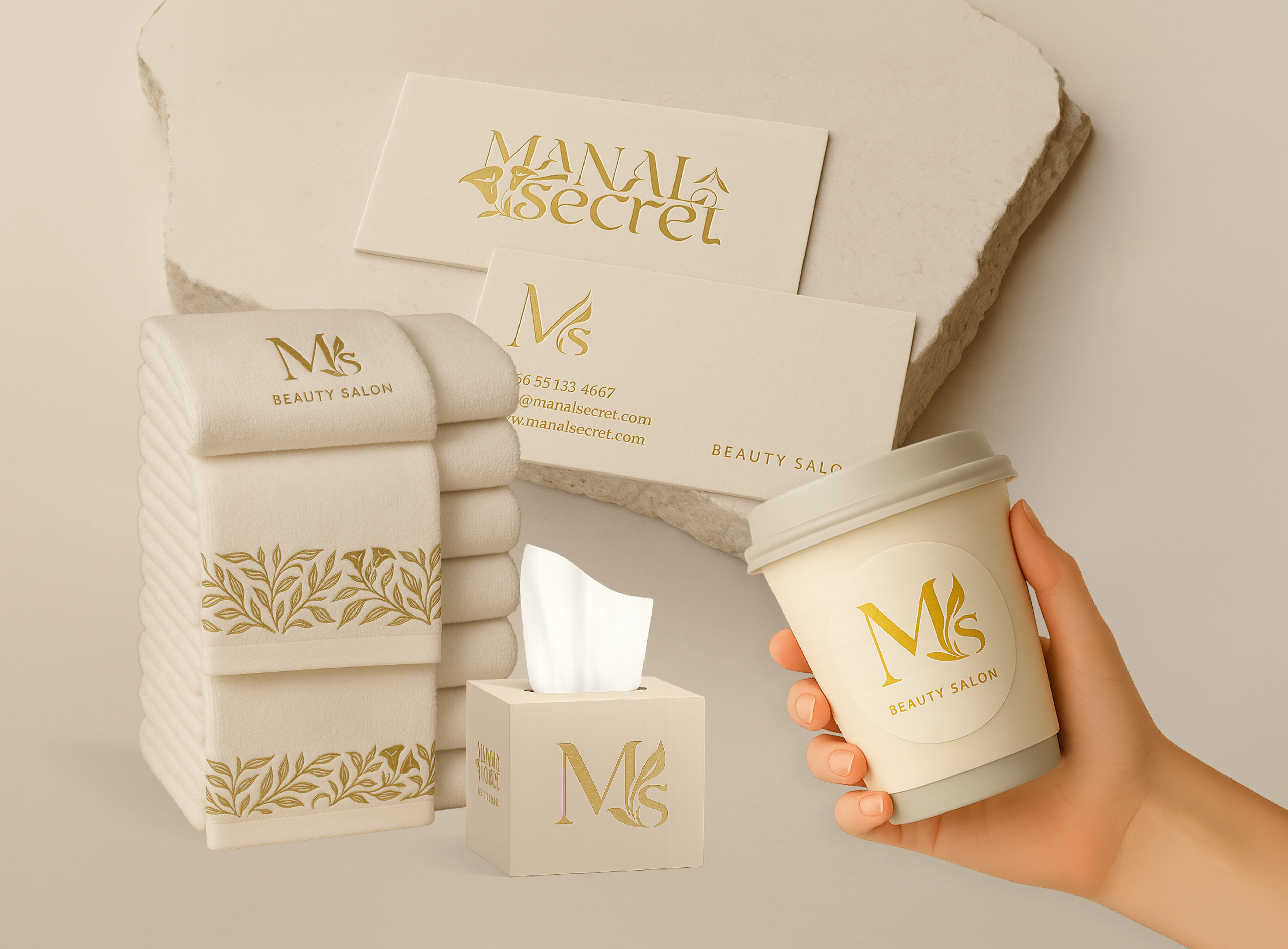
The brand extends gracefully across a curated set of collaterals, from packaging and uniforms to stationery and everyday touchpoints within the salon.
A signature pattern, drawn from the calla lily within the logo, subtly flows through the applications, bringing a sense of softness and continuity. Paired with warm neutrals and refined gold detailing, each element is designed to feel elevated, cohesive, and unmistakably Manal Secret.
Designed for the Scroll 😉
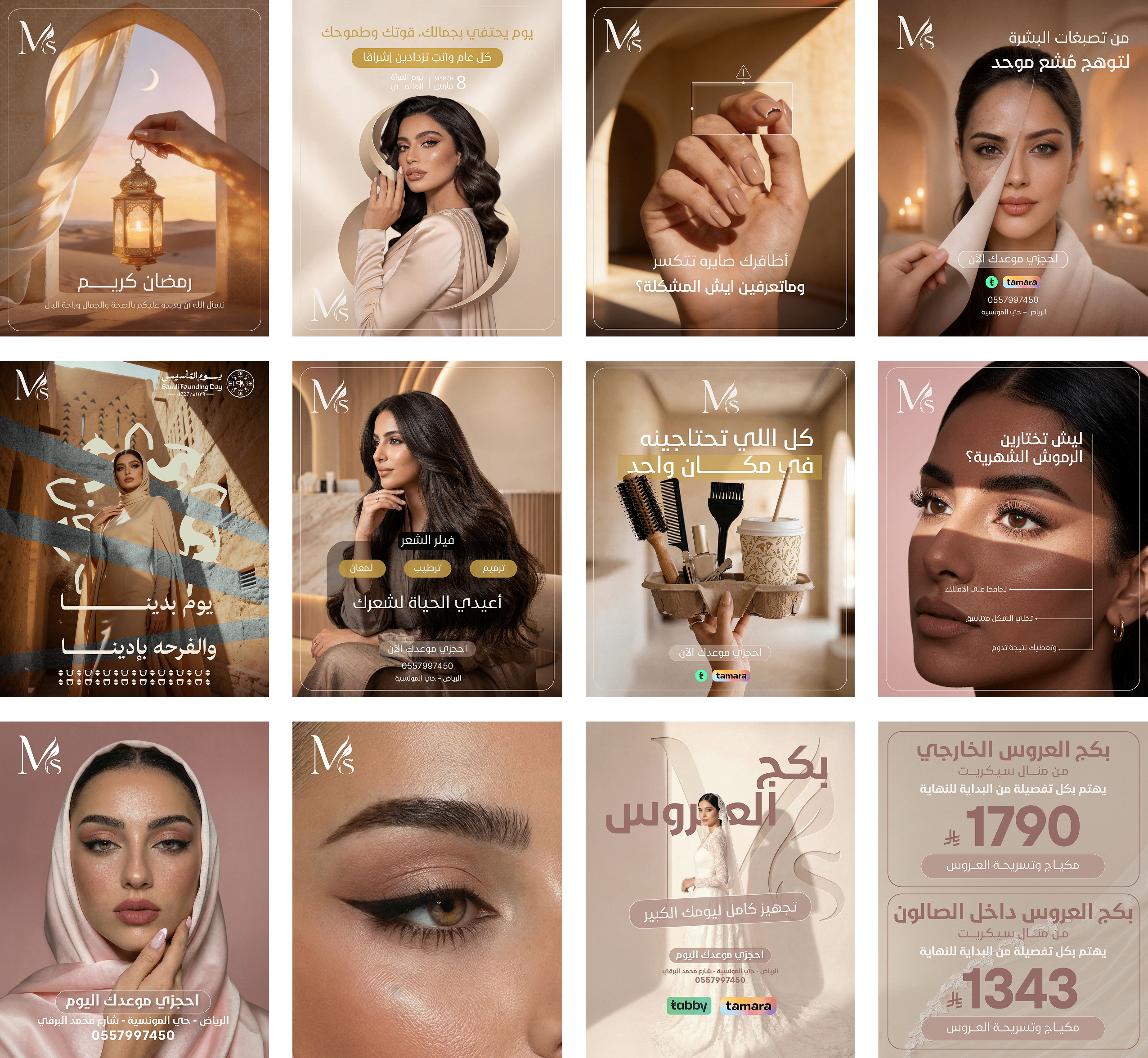
Manal Secret's social media is crafted to feel less like content and more like an experience. Every post is intentional, built on soft tones, clean layouts, and refined details that mirror the brand's aesthetic.
The feed thoughtfully alternates between blush pinks and warm gold tones, creating a balanced, well-studied rhythm that keeps the visual language dynamic yet cohesive, resulting in a presence that feels calm, elevated, and instantly recognizable.